Module Evaluation
Overall this module has been challenging yet extremely educating. At the beginning of the module I struggled to decide what exactly I was trying to investigate and if it was researchable, the first tutorial with my academic supervisor helped discuss what research themes I could investigate and the timescale I would need to stick to in order to submit my work with enough time. It was decided that I was going to research into the way genders have been presented in advertising and how that has transcended into the branding of cosmetics. The academic texts that I studied helped gather different theories and arguments from numerous sources which helped support the argument, the feedback given from my draft highlighted the strengths and weaknesses that I could improve and edit, my essay appeared slightly biased I had to bring in more sources to balance the argument. Quantitative research was undertaken as it was appropriate to hear the publics opinions and what they associate certain colours with genders. Two surveys was made with over 50 responses for both, the first one conducted was asking the public if a brands aesthetic affected their choice in purchasing a cosmetic product and if certain colours were feminine or masculine. This supported the argument in the first chapter as it highlighted the construction of gender within western society and what we perceive as masculine and feminine. The second chapter asked the public what brands of cosmetics they use and if they would try an alternative brand if it was available for both males and females, the response helped initiate the idea for creating my own gender-neutral brand.
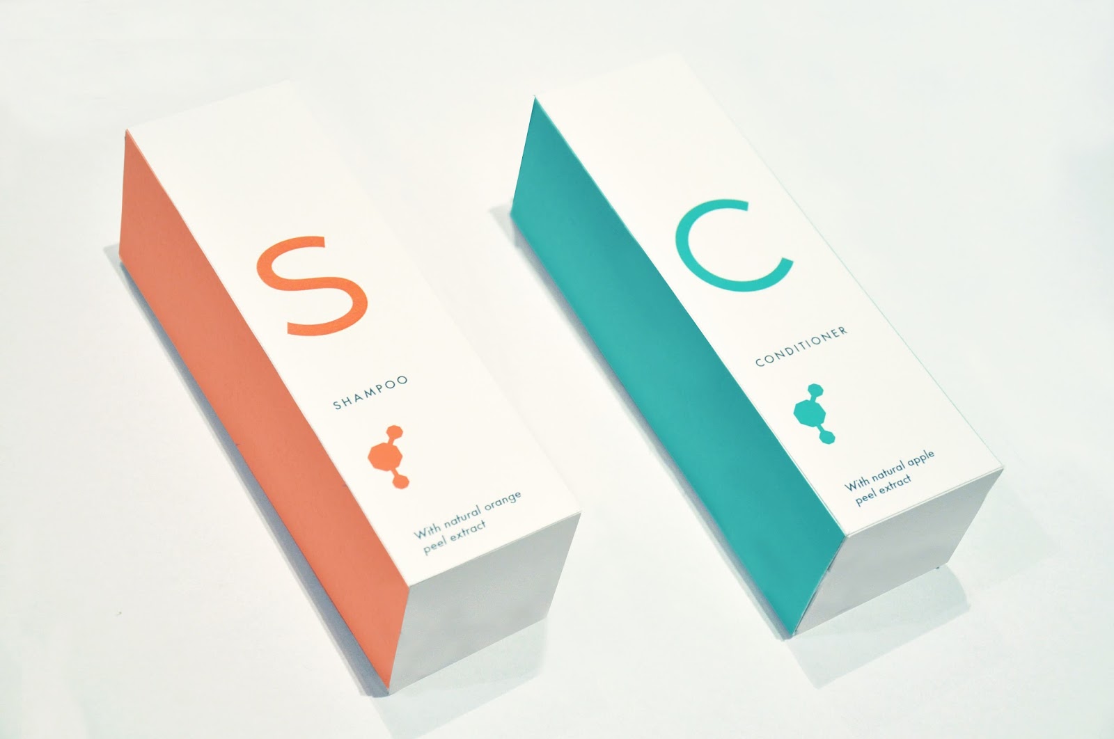
The practical was a huge challenge as almost every decision I made for the aesthetic was in risk of signifying feminine or masculine connotations; type, layout and the colour scheme was carefully decided as to try and communicate my message in the most simple yet effective way. The type chosen is called Colaborate, this was decided between Futura and Helvetica. The type could not signify masculine or feminine connotations therefore I avoided serif and bold fonts, the san serif type is minimal yet approachable giving the design a foundation to work on. The colour was decided after a long time experimenting with different colour schemes, again the colours chosen could not signify certain genders therefore using my research I chose a mixture of primary colour to be easily recognisable as a brand and efficient throughout. The layout for the packaging again is simple and effective, the enlarged letter on the front helps communicate what the product is itself in the most simplest form. Embellishments were avoided as from my research they signified a more feminine aspect to the design, therefore utilising white space and keeping the minimal aesthetic communicates to the consumer is the quickest and effective way. The logo also contributes towards the design as it represents the unity of genders whilst also resembling a scientific value which communicates how we are all made from the same biological matter. Testing the product gave an insight into if the execution was successful and hit all gender types, most responses said that the product did not appear masculine or feminine and would be something they would like to try.
Overall I am fairly pleased with the dissertation however, I feel that more content could have been added with more time. After I had submitted my draft I was confident I would be hitting over the 6000 word count, instead after a lot of editing and adding bits to different parts to the essay it brought me just below that. Now as I'm evaluating I am concerned there is more I should have researched and wrote about to make it a solid body of work, although I'm reassuring myself that the argument is concise and to the point. The research itself has educated me on gender and the functionalities of advertising and the branding for cosmetics, overall I've found it invigorating and something I've gained a passion for. As gender fluidity was fairly new to me its been satisfying to study into gender itself and how it has manifested to what it is in todays society.


Week/Session
05/10/2015 - OUGD601 CoP Module Briefing
12/10/2015 - Group Presentations
19/10/2015 - Tutorial - Clarified research question: The question was not formed at this point and the key topic to focus on was still being discussed, as gender neutral brands are only just emerging there was concerns for the difficulty on getting enough research from primary and secondary resources.
26/10/2015 - Tutorial - Discussed progress on research and whether it was relevant.
02/11/2015 - Tutorial - Chapter one discussion however I had not completed it yet.
09/11/2015 - Tutorial - Chapter one complete and objectives were discussed to ensure I stayed on track for submission.
16/11/2015 - Tutorial - Aimed to have 3000-4000 words wrote by this point which I had just below achieved.
23/11/2015 - Tutorial - Chapter one submitted to Turnitin
30/11/2015 - Tutorial - Back on track with the first two chapters complete and halfway through third chapter.
07/12/2015 - OUGD601 CoP Module Re-Briefing
07/12/2015 - Group crit (practical element) - Good feedback which helped ideas
04/01/2016 - Module submission briefing
11/01/2016 - Tutorial - On track, completed dissertation with practical printed.
14/01/2016 - Submisson


Logo development

The logo development helped the aesthetic of the packaging as I wanted to keep the minimal theme yet still be informative and effective. The process tried different shapes as I wanted so communicate a scientific aspect to the design which would represent that biologically we are made from the same elements. However, I did not want it to look too clinical and unfriendly therefore I chose to reflect the two gender symbols joined together which also resemble bubbles and reflect what the product is.
Colours

The colours that I decided to go with went through a hard process of trial and error. As the colours could not be suggestive towards a certain gender, the research gathered helped initiate what would be appropriate. Pastel and bold colours I tried to stay away from as thats what gendered products appear to be branded with when targeting male and female audiences. The choice of colours I decided to go for were mainly a mixture of primary colours, this helped keep the minimal design fuss free and simple for the audience to identify with.


I tried to visualise what my idea's would look like on the product. One of my ideas was to look at patterns from hair and skin and create something that would be simple yet effective whilst also communicating to the consumer that were all made from the biological matter.

These are the other ideas I had, the product needed to communicate to a large audience in the most simple and effective way therefore I did not continue these ideas.

Moving on the idea chosen was to use an enlarged letter to represent what the product was itself, this I thought was a good way of communicating the consumer as not to confuse them with misinformation and embellishments that could signify feminine or masculine connotations. The idea for the name of product is to be called 'Me' as its not for men or women in particular but instead its just for me addressing the audience on a more personal level.
Aims:
For the practical side of my dissertation my aim is created a gender neutral cosmetic brand. The brand would be aimed at males and females between 13-50 year old, this is quite a broad range of ages however this brand would hopefully substitute current cosmetics that are available and educate people that our body's work the same regardless of gender.
Brand aims:
- Brand that will be a substitute for other cosmetics
- Reduce costs and clutter for families
- Environmentally friendly - packaging will be recyclable
- No harm to animals - natural ingredients
- Different fragrances and scents available for each type of cosmetic
Packaging ideas
Idea 1:
- Biological influence to design
- Looking at patterns of hair and skin under microscope
- Reflects that regardless of gender we are made up of the same matter
- Different scents available for each type of cosmetic
Idea 2:
- Clean and minimal aesthetic with subtle elements to represent the fragrance in bottle
- Scents will be different fruits and fragrances but still natural ingredients
- Reflects how the bottle uses nothing but natural non fussy ingredients, what you see is what you get without it being suggestive or influential to a certain gender.
Idea 3: Crazy idea??
- Minimal design with a singular square representing the start of the brand.
- More squares are eventually added when more parts of the world use the product over other cosmetics.
- Eventually the design will fill up with squares making the audience feel they are part of a unified commitment to the cosmetic which helps the environment, reduces costs/clutter, non suggestive to gender and is non harmful to animals.
Idea 4:
- Minimal design with colours to represent different uses e.g blue for shampoo, dark blue for conditioner, orange for body wash.
- Different scents available
Popular Posts
-
 I really love the simplicity of the design and is something I feel has influenced my practical the most. The use of the clean vec...
 -
 Gender Neutral Cosmetics Source: http://www.nellyrodilab.com/en/beauty-en/gender-neutral-cosmetics.html S.W Basics of Brookly...
 -
Making Connections: Summarise the session discussing what you have learned about 'deconstruction' and 'pastiche' The emp...
-
 The grid system in graphic design is a way of organizing content on a page, using any combination of margins, guides, rows and columns....
 -
 LEEDS COLLEGE OF ART PROSPECTUS Front cover Pg 30 Pg 68 & 69 After looking through the new university...
 -
 - Research - 12 People responded to my survey, 11 being 18-20 and 1 being between 21-29 age groups. I would of liked more respon...
 -
 - Research - I was suggested Fontsmith to have a look at different typefaces which may be suitable to my current brief. From what I h...
 -
- Research - This website let me see how charities and campaigns have went successfully viral in 2012, it enabled me to get a better u...
-
Week/Session 05/10/2015 - OUGD601 CoP Module Briefing 12/10/2015 - Group Presentations 19/10/2015 - Tutorial - Clarified resear...
-
 For this brief we were assigned a partner to create a typeface for a full alphabet including 6 extra glyphs based entirely on their per...
